Watercolors.
On this site you will find a number of studies, alle done n watercolor. This particular type of watercolors are transparent.
Since it is often nessasery to use a significant amount of water, the paper often get soacked, it is important that the paper is created for this.
Because this watercolor is tranparent it is not possible to cover mistakes with new layers of color and the only white or light is tat of the paper.
Most of these are done during a period from 1987 till 1988, a few is as late as from 1991.
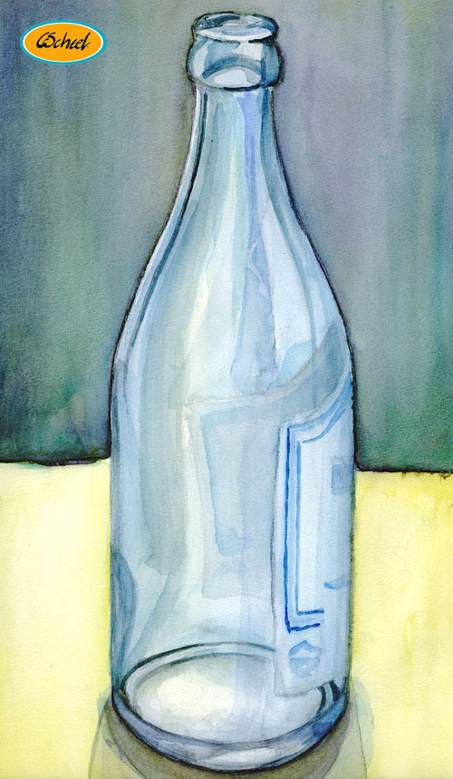
Clear bottle.
Watercolor from 1988.
The very dark lines have emerged from floating color being draged towards the edges.
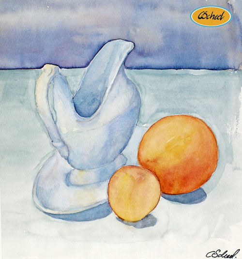
Jug with oranges.
Watercolor from 1988.
I have been working with complimentary color for the background, the orange color in the oranges and the blue or purple blue in the background.
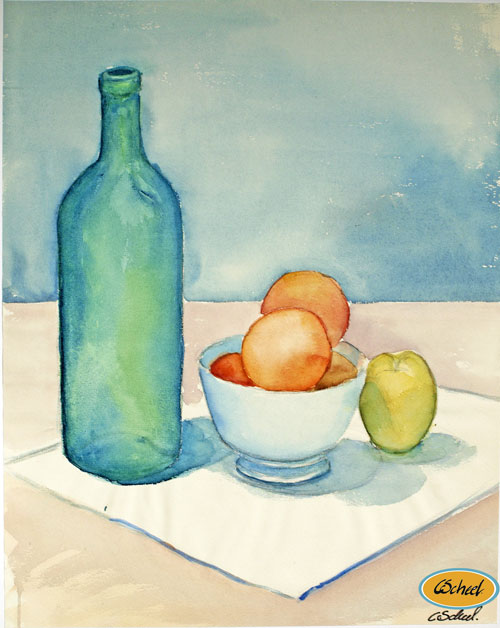
Posture or pose.
Watercolor from 1988.
Positure or nature morte of bottle and oranges.
I have been working with complimentary colors for the background, between the orange in the oranges and the blue or purple blue for the background.
The soft rose colors in the cloth and the green in the bottle, are also complimentary colors.
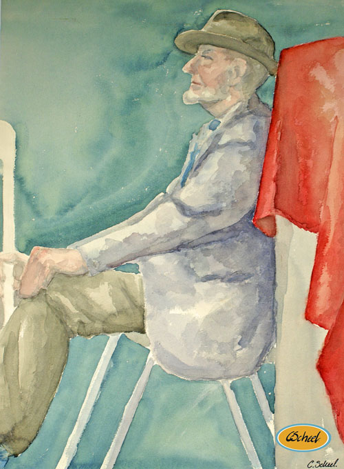
Study of a man sitting.
Watercolor from 1988.
I have been working with complimentary colors for the background, the red cloth in the front versus the green tone in the background.
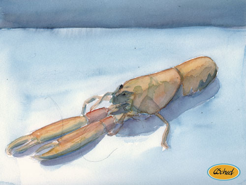
Nephrop.
Watercolor from 1987-88.
Here I have been working with complimentary colors, the blue colors on the table surfacefarve and the orange colors of the nephrop.
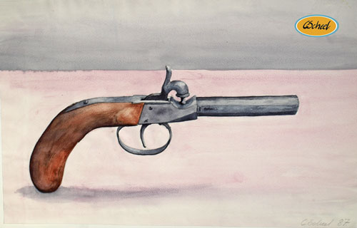
Antique gun.
Watercolor from 1987.
I have chosen to show the gun upright, without showing what is keeping it up, for visual or dramatic reasons.
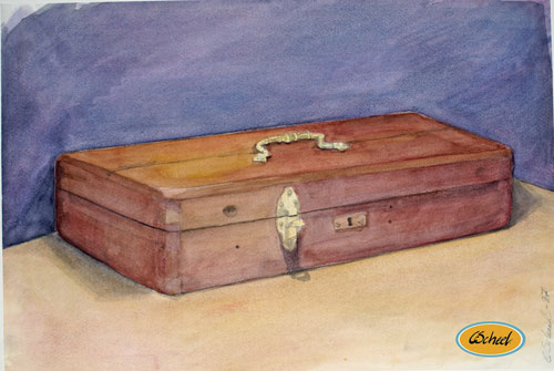
Antique box or shrine.
watercolor from 1987.
A study of a box or shrine, which was oriniganlly used to contain an iron to shape a priest collar.
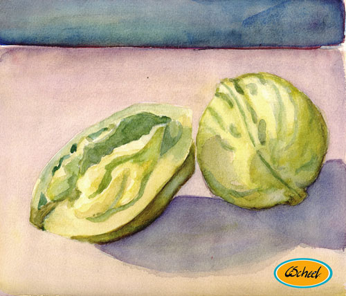
Wald nuts.
Watercolor from 1987-8.
A study of nuts, hole and in half, as a way to also show the inner of the nuts.
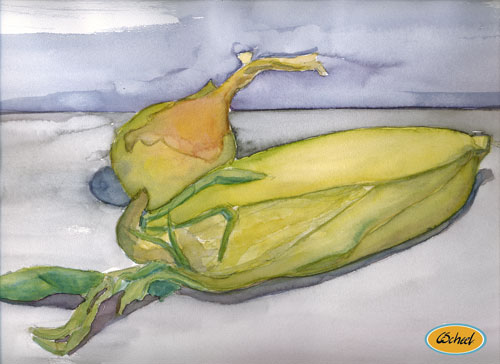
Onion and corn.
Watercolor from 1987-8.
A study of an onion and a corn flask.
I have been working with a complimentary set of colors, the yellow tones in the front and the violet or purple color tones in the background.
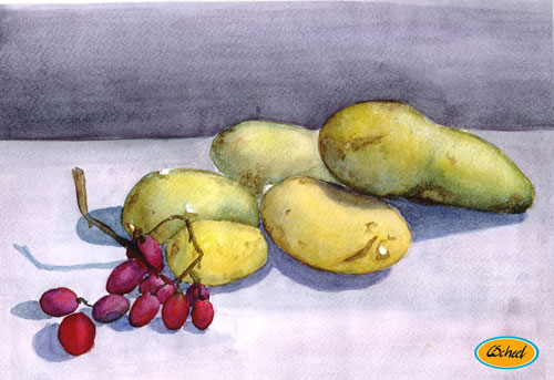
Grapes and potatoes.
Watercolor from 1987-8.
A studie of some grapes and potatoes.
I have been working with a complimentary set of colors, the yellow colortones in the front and the violet in the back, wich also gives me a warm cold color perspective.
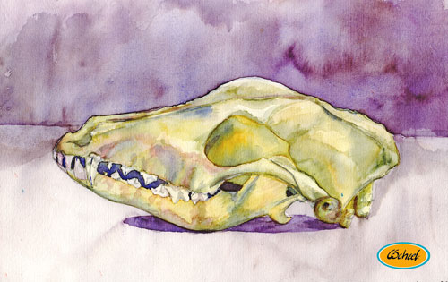
Animal Cranium.
Watercolor from 1987-8.
A study of an animal cranium.
I have been working with a complimentary set of colors, the yellow colortones in the front and the violet in the back, wich also gives me a warm cold color perspective.
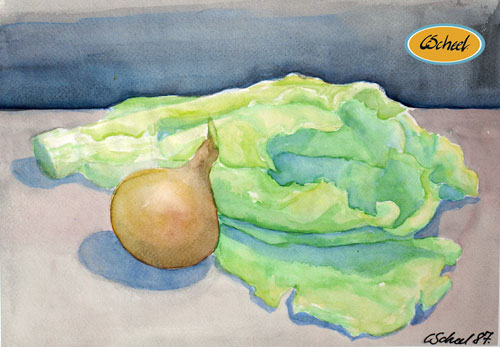
Lettuce and onion.
Watercolor from 1987.
A studie of a lettuce and an onion.
I have been working with color intensity or the color saturation, as color perspective, by having the saturated colors in the front and the less saturated colors in the distance.
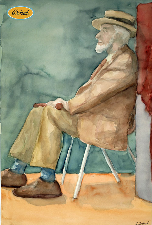
Study of a sitting man in varm colors.
Study in Watercolor from 1987-88.
I have been working with a complimentary set of colors, the red in the fabric in the front versus the green in the background.
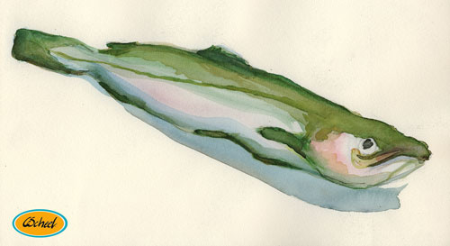
Study of a fish.
Watercolor from 1987-88.
I have been working with a complimentary set of colors in the fish, the dominante green in the body and the soft red in the head and along the sides.
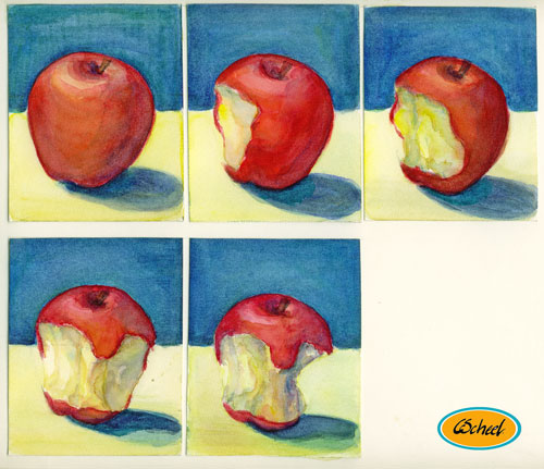
An apple.
Study in watercolor from 1987-88.
Here I have been working on creating a watercolor study, taking a bite of the apple, and then created a new watercolor study and os forth.
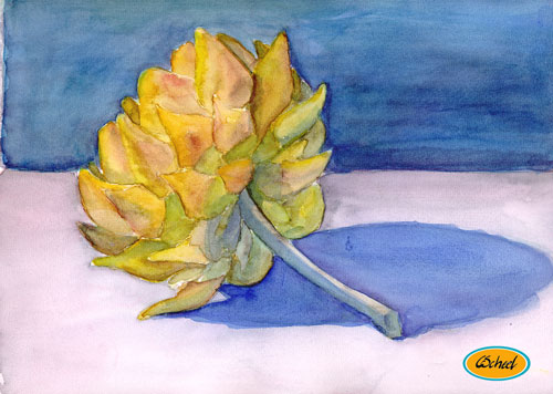
An artichoke.
Watercolor from 1987-88.
I have been working with a complimentary set of colors,the yellow and orange tones in the foreground, against the blue and violet in the back ground and in the shadows.
There is also an other set of complimentary set of colors, between the light red in table surface and the green in the artichoke.
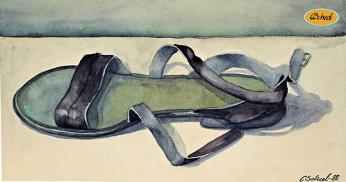
Study of a sandal.
Transparent watercolor from 1988.
I have been working on presenting the sandals construction as well as the quality of the leather in naturalistic colors. The redish surface creates a complimentary color.
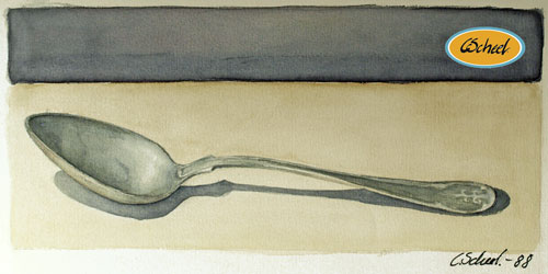
Study of a spoon.
Watercolor from 1988.
I have been working on presenting the worn out spoon and the quality of the metal.
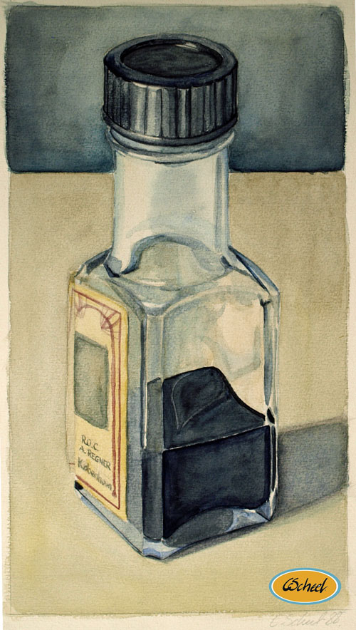
Study of an ink bottle.
Watercolor 1988.
I have been working on presenting how the light is reflected in the glass of the bottle and the ink inside the bottle.
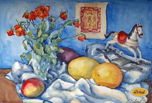
An arrangement.
watercolor from 1991.
An arrangement of a glass with roses, fabric, fruits and a rocking horse.
I have been working with a complimentary set of colors, the orange and yellow in the fruits against the blue and purple in the background and in the eggplant.
In the front I have warm yellow and orange colors in the fabic, which creates a colorperspective in the fabric.
I have been working with an other complimentary set of colors, the red in the roses, the rocking horse, the fruits and the green in the fruits and the leaves.
I have chosen to place a small art print on the wall behind the arrangement, to create depth.